Optimizing for mobile devices ∞
Websites are used everywhere. People access them on the go, on the train, when they are hiking or when they relax on the couch at home. This profound change in user behaviour was made possible by rapid developments in the smartphone and tablet markets in recent years. As a result, website visits from mobile devices have considerably increased, by over 400% on the Outdooractive Platform in the past two years.
Compared to desktop computers, mobile devices are characterised by touch displays, smaller screen sizes, limited computing power and reduced Internet bandwidth. These conditions pose the following new challenges and requirements for developing websites:
- Automatic adaptation to different screen resolutions
- Screen Design patterns that are optimised for touch
- Efficient use of resources like bandwidth and computing power
Responsive websites change their layout depending on the screen resolution. For websites that provide little interactivity, “responsive design” is often sufficient. One of the most popular examples for responsive web design is the website of the Boston Globe, a US newspaper. No matter which device, the website’s markup is always the same; only the layout adapts dynamically. Responsive design alone, however, is not enough to meet the requirements of the Outdooractive Platform. Interactive maps and result lists that users want to sort and filter set high demands on memory usage, computing power and battery lifetime. These are the main reasons why instead of just setting up a responsive website, we decided to go one step further and develop a mobile-optimised version for the Outdooractive Platform. Less JavaScript code, focussed functionality and a clean design that meets the special requirements of mobile devices define the cornerstones of our approach.
Design Requirements for Mobile Websites and Maps
Devices with touch displays do not only require new technical solutions, but also pose new challenges for design. A computer mouse enables users to accurately select even very small elements. Fingers and especially our large thumbs are much more imprecise to use than a computer mouse. For mobile design, this means that buttons and other clickable elements need to be suitable for thumb interaction. For clickable elements (touch targets), Microsoft suggests 9 * 9 mm, while Apple recommends at least 44 * 44 pixels.
Just like touch targets, increased font sizes make content on mobile devices more usable.
Most touch screens display more pixels per cm than desktop computers (this is referred to as pixel density). The content appears to be smaller. Larger typography helps to counter this effect.
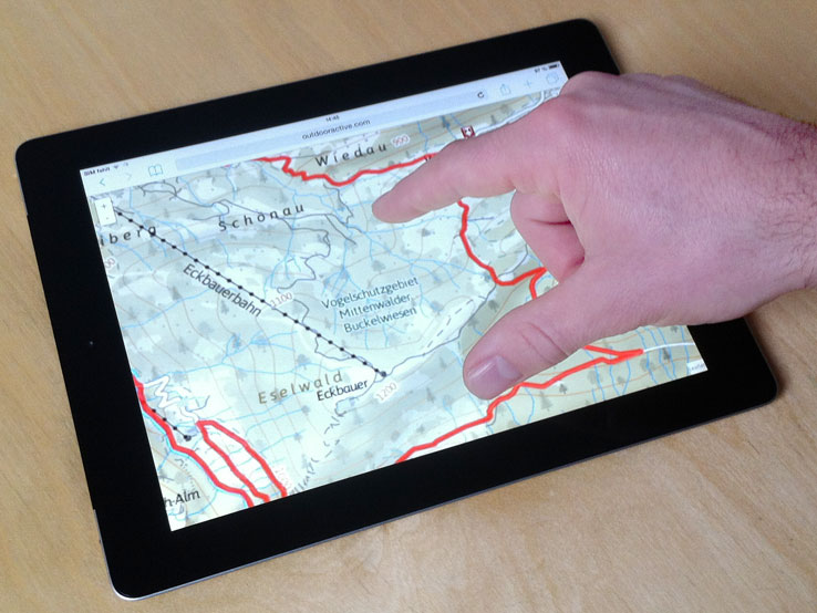
A problem that especially occurs when using interactive maps are pinch and scroll gestures. Pinch is commonly used for zooming. With a pinch gesture, the browser magnifies the content. Fonts are redrawn. Images are enlarged. However, for interactive maps, we desire a different behaviour. When using pinch, the map should be zoomed-in. To achieve this, map tiles are loaded and displayed in a higher zoom level. In order that browser zoom and map zoom don not interfere in an unintended way, we decided to disable the browser zoom for the Mobile FlexView component by using the HTML viewport attribute.
<meta name="viewport" content="width=device-width, initial-scale=1.0, maximum-scale=1.0, user-scalable=no" />
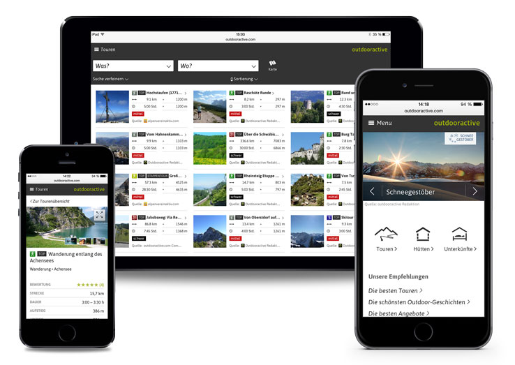
The scroll gesture has similar characteristics. In an interactive map, fingers should be used to move the map. However, if a website is scrollable because it is larger or wider than the browser window, the finger will move the website up or down in the browser. To prevent conflicts between browser scrolling and moving the map, we only offer interactive maps in fullscreen mode. This way, we can ensure that no unintended scrolling occurs and the interactive map always works nicely. These examples illustrate that mobile websites and especially interactive maps have new requirements for design and technology. Keep it small and simple applies more than ever in these cases. The FlexView module with its detail pages is a core component of the Outdooractive Regio product and the Outdooractive API and it can present a wide range of contents. The mobile optimised solution includes the following features:
- Display of different content types (e.g. tours, huts) in a list and map view
- Support for sorting and filtering contents by different criteria
- Location-based search for contents in the user’s vicinity
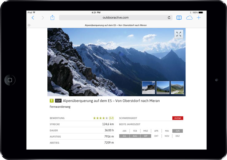
- Emotional presentation of tours, huts and other content types on detail pages, including large image galleries
- Interactive maps for all contents. Users can locate themselves on the map. The position of the user is automatically updated while moving.
- Current weather and forecasts
The Mobile FlexView module covers display sizes from 300 to 1000 pixels and is perfectly suited for smartphones and tablets. A few lines of JavaScript code can be added to automatically decide if a Mobile FlexView is used or not. The decision about the FlexView version is not solely based on screen size, but also depends on touch support of the device, as many of the optimisations outlined before have been implemented to provide better touch interactions.
If the automatic behaviour is not desired, developers can specifically decide for the desktop or the mobile optimised version by using configuration parameters of the JavaScript API.
Please read our
to learn about the details of integrating the FlexView API on mobile devices.
For technical details or licence and plans, please contact us